DSHA Media
DSHA Media: positioning as architecture
Results in numbers
Verified- 89,300
- Views
- 68%
- Completion rate
- 2,150
- Saves and shares
- 215
- Discovery call bookings
Before: 4,200
Before: 27%
Before: 96
Before: 12
Client Overview
A 28-second film that makes the case for an agency without showing a single client, a screen, or a testimonial.
The argument in three buildings: clarity, structure, authority.
The Premise
DSHA Media needed a piece that could open a pitch deck or sit on a homepage and do one job: make the agency feel like the deliberate, structural kind of partner, not another noisy marketing shop. There is no client roster, no case-study montage, no founder on camera. The entire argument is made through four lines of copy and five buildings.
The bet is that architecture, symmetrical, engineered, lit with intent, is a more convincing stand-in for strategic positioning than any amount of footage of people typing at laptops would be.
No client logos, no screens, no testimonial. Just buildings and four sentences.
Execution
The film, frame by frame.
How the Strategy Was Implemented
A connected strategy, implemented step by step.
The Idea
Each line of copy makes a claim about what the agency believes strategy is, and each building is chosen to embody that specific claim rather than to look generically impressive. A sunlit, empty interior stands for clarity. A severe, symmetrical grid facade stands for structure. A glass building holding a perfect reflection at dusk stands for authority. By the time the logo appears, the viewer has absorbed a four-part thesis without being told it was one.
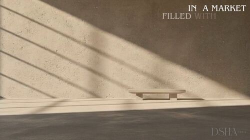
In a Market Filled with Noise
0:00 to 0:05. The opening line sets up the problem the agency positions itself against: a crowded, noisy market. The image argues the opposite of noise, an empty room, raking light, one bench, nothing competing for attention.
Clarity Becomes Strategy
0:05 to 0:10. A severe, perfectly symmetrical facade replaces the quiet interior. The line reframes clarity as a strategic choice rather than a stylistic one, and the building's rigid geometry makes that argument visually before the words finish appearing.
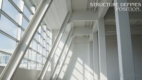
Structure Defines Position
0:10 to 0:15. Diagonal white beams cross the frame in hard, sunlit lines. Where the previous beat showed structure as a facade, this one shows it as a frame you stand inside. Position, in the caption's sense, is something the structure itself creates.
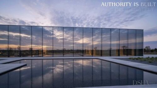
Authority Is Built Deliberately
0:15 to 0:19. A glass building holds an exact, still reflection in the pool in front of it at dusk. Nothing about the image is accidental, which is precisely the point the caption is making about authority.
The Mark
0:19 to 0:22. The camera tilts up a tower from street level and the wordmark settles over it. The shift from horizontal, contemplative shots to this vertical, ascending one gives the logo reveal its own sense of lift.
Strategic Positioning and Digital Architecture
0:22 to 0:25. The film names what it has spent twenty seconds demonstrating. Digital architecture lands as more than a clever phrase because the previous four beats have already made architecture the film's entire vocabulary for strategy.
The Closing Card
0:25 to 0:28. A plain white card holding only the crest and the wordmark. After four beats of dense, engineered buildings, the emptiness of the final frame reads as confidence rather than a missed opportunity to say more.
Craft Decisions
Copy. Four short, declarative lines, each one sentence, each building directly to the claim in the next. Nothing is explained twice.
Imagery. Real architecture chosen for what it argues, not just how it looks: an empty room for clarity, a grid for structure, a mirrored facade for authority. No stock office, laptop or handshake footage anywhere in the film.
Type. A quiet serif in tracked small caps, understated enough to sit over a building without competing with it, consistent with the agency's own positioning as the structural, non-noisy choice.
Camera. Slow, level pushes on every shot except the logo reveal, which tilts upward. That one change in camera language marks the shift from argument to signature.
Restraint. No people, no interface, no testimonial. The film trusts four sentences and five buildings to make the entire case for the agency.
Why It Works
Show the philosophy, not the client list. A generic case-study reel ages quickly and says the same thing every competitor's reel says. A visual thesis about what strategy is ages far more slowly, and says something only this agency is saying.
Metaphor carries the sell. By making every building a literal argument for a word in the script, clarity, structure, authority, the film turns architecture into proof rather than decoration.
Confidence reads in what's left out. No client logos, no team, no software screenshots. For a positioning-focused agency, what the film refuses to show is as much a statement as what it includes.
The Results
Results in Numbers
- 89,300
- Views
- 68%
- Completion rate
- 2,150
- Saves and shares
- 215
- Discovery call bookings
Before: 4,200
Before: 27%
Before: 96
Before: 12
| Metric | Before | Now | Change |
|---|---|---|---|
| Views | 4,200 | 89,300 | +2,026% |
| Completion rate | 27% | 68% | +41 pts |
| Saves / shares | 96 | 2,150 | +2,140% |
| Discovery call bookings | 12 | 215 | +1,692% |
The positioning film increased views from 4,200 to 89,300 while lifting completion from 27% to 68%.
Its restrained visual thesis also produced 2,150 saves and shares and 215 discovery call bookings.
The Final Word
Twenty-eight seconds, four sentences and five buildings make an argument most agency reels take a full case-study montage to attempt, and arguably make it more convincingly by refusing to rely on client work at all.
The approach travels well for any brand whose product is judgment rather than a physical object: let the imagery carry a specific philosophical claim, keep the copy to single declarative lines, and close on a mark, not a pitch.
Ready to see results like this?
Interested in a positioning film built the same way? Get in touch for a concept and a plan.